
Moody Floral Painting: Inside Verdant Bloom, a Vintage Green Original
This piece, Verdant Bloom, didn't come together the way I expected it to.

I knew what I wanted going in: a red-orange flower, bold and unapologetic, against a deep green ground. Simple enough on paper. But the color wouldn't settle. I mixed my way through range after range of red-orange, testing warmer, cooler, brighter, more muted, chasing something I couldn't quite name until I saw it. When I finally landed on the right red, I turned to the background and realized the green didn’t fit in anymore. So I started again, layer after layer of green, shade over shade, until the background finally had the depth I was after.
That's the nature of a moody floral painting. The background isn't a backdrop, it's a color decision that has to hold its own against the bloom. By the time I stopped, there were more colors underneath this painting than most people will ever see on top of it. What looks like one confident red bloom on one settled green ground is actually the result of the piece refusing to be rushed.
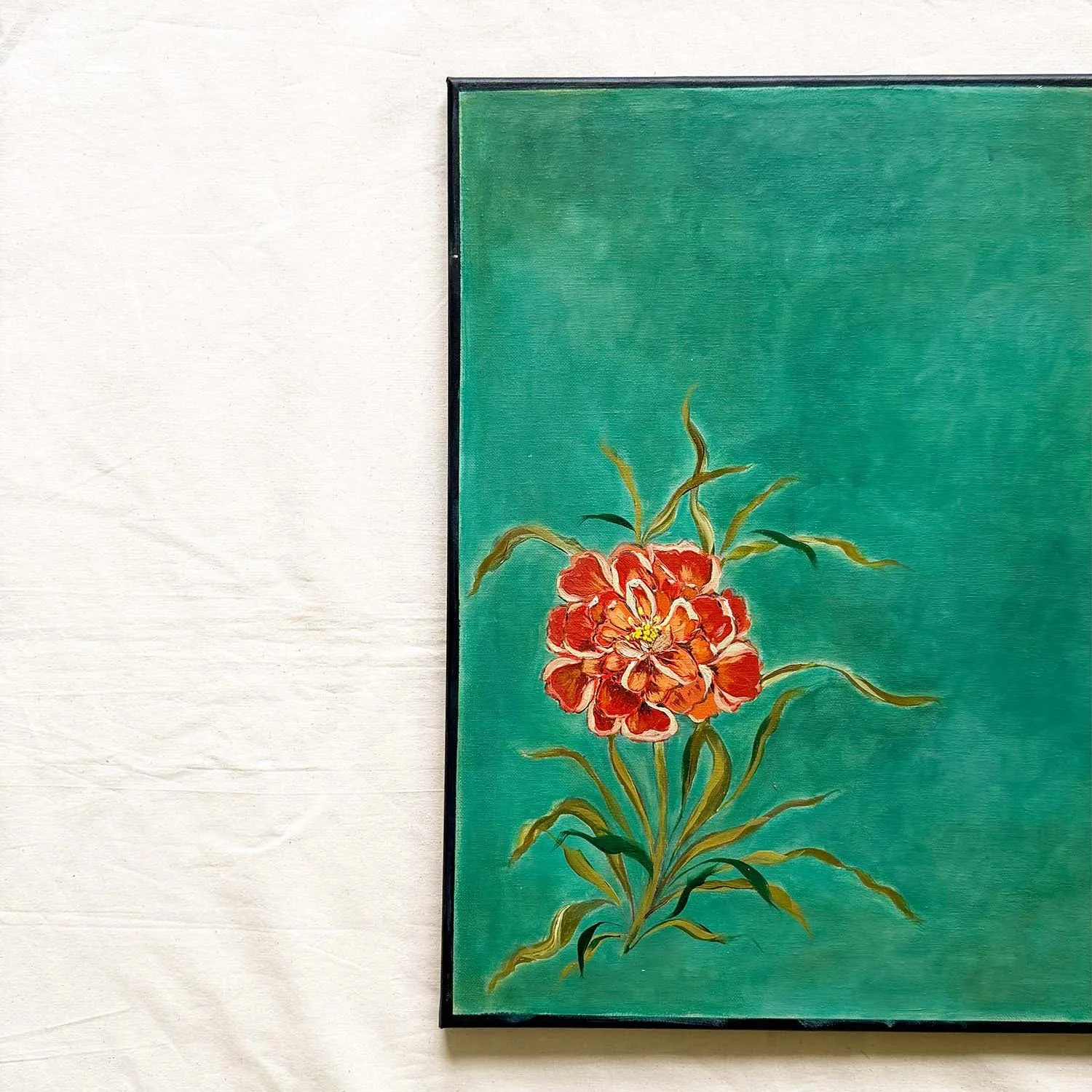

I think that's fitting. My florals belong to a body of work I call Quiet Strength, built on the idea that each bloom stands tall and holds its ground unapologetically, the same way my landscapes carry rooted, weathered trees standing through every storm. Verdant Bloom did exactly that during its own making. It didn't take the first red I offered it, or the first green. It held out until the color underneath was actually right, which is, in a strange way, the same discipline the finished flower is asking you to notice: calm that doesn't rush, strength that isn't the absence of effort but the result of it.
